Patch notes
New ways to remember kana, and a closer look at how the font has changed.
Mnemonic examples added
Picture cues connect a kana’s shape to a familiar word. Here are three examples from the selected drawings used in the trainer. The highlighted part of each word helps you remember the sound.
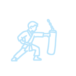
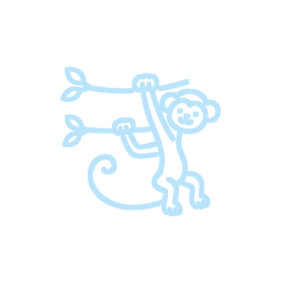
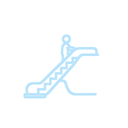
The kana font, then and now
The same three kana at the same size: original text, the previous glass treatment, and the new mounted neon sign.
Printed kana with a soft glow.
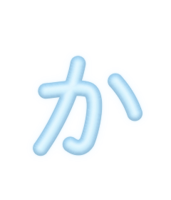
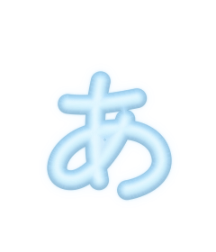
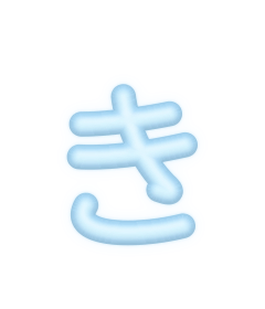
Rounded glass tubes with smooth reflections.
Raised tubes, softer mounting shadows, and sharper inner light.
Choose Neon in the trainer’s font settings to use the new look. Correct typing brightens the inner light and exterior halo; successful answers breathe softly as they move into history. Kana stroke artwork adapted from KanjiVG, © Ulrich Apel, CC BY-SA 3.0.